3 Stellar Email Marketing Campaigns for Successful Content Marketing
Email Marketing Campaigns
Four decades after Ray Tomlinson created the first email system, email continues to be the best performing marketing channel. It consistently outranks social, search and display in ROI, and offers top conversion rates across industries.
Email marketing campaigns are a fundamental part of any content marketing campaign. In fact, you can even say that much of content marketing is designed to achieve one goal: capture email addresses.
So how does one create a top-notch email marketing campaign? In this post, we’ll look at a few top-performing campaigns, and see what we can learn from them.
BUZZFEED
Buzzfeed is an internet powerhouse. It attracts nearly 190M visitors to its site every month, boasts 2.4M followers on Twitter, and 5.1M likes on Facebook.
As you can imagine, email figures high in priority for this media company.
Here’s what we can learn from Buzzfeed:
- Offer separate emails for each content category
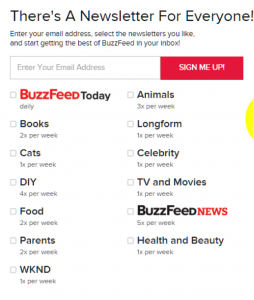
When you try to sign-up for Buzzfeed’s email list, you will first be asked what content you actually want to see in the email.
This is useful for two reasons:
- Buzzfeed publishes hundreds of posts every day. Asking users what they’re interested makes sure they get only the most relevant new posts in their inbox.
- Asking users to select content categories helps in segmenting the audience. This way, Buzzfeed can send content and ads tailored to the audience.
You will also notice that Buzzfeed mentions exactly how many updates you’ll get in your inbox each week.
- Use a design that matches your content
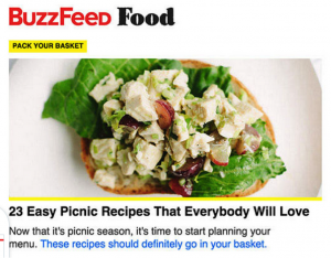
Buzzfeed’s emails are especially well designed with a focus on visual content:
The design retains a consistent user experience from email to the Buzzfeed website and app. The content itself is heavily curated, with Buzzfeed promoting only the most relevant stories in the email.
Altogether, this helps make email one of the strongest drivers of growth for Buzzfeed.
SIDEKICK
Sidekick is a top content marketing tool for tracking outgoing emails. It’s an invaluable weapon in any sales, marketing or PR professional’s arsenal.
Sidekick’s email campaign is essentially a collection of updates from their blog. There is no clever automation or smart visual design at play.
What stands out, however, is the simple, smart execution.
When you sign-up, the first thing you’ll notice is the subject line. All of Sidekick’s emails have clever, curiosity generating subjects you can’t help but click on:
Headlines like this work for three reasons:
- The sender is a person, not a company (“Scott from Sidekick”, instead of just “Sidekick”).
- The entire subject line is in lowercase. This makes it visually different from other emails in the inbox and draws attention.
- All subject lines generate curiosity by promising to give away some little known information (such as “abraham lincoln’s unconventional technique”).
The content and design of the email itself is nothing extraordinary. There is no personalization or localization, and the email just recaps the latest blog post.
However, there are a few things we can learn from this as well:
- Single focus: The email does not have multiple columns or posts. It is singularly focused on updating the reader about Sidekick’s new blog post.
- Teaser content: All emails are between 100-200 words in length. For reading further, you have to click on the ‘Read More’ button at the bottom. This does a good job of teasing the reader without overwhelming/underwhelming him with too much/too little content.
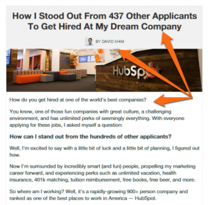
- Header image: Each email has a contextually relevant header image that amplifies the content message. It also adds visual flair to what would otherwise be a dull, text-only image.
- Author image: There’s an image of the email’s author right below the title. It makes the reader feel that the email is coming from an individual, not a big business. This gives it a sense of intimacy missing from many email marketing campaigns.
If you publish limited content and want to update your readers about it, Sidekick’s campaign is a good model to aim for. It is focused, well-executed, and doesn’t overwhelm the reader.
FURTHER.NET
Further.net is an email newsletter on ‘How to Live Your Best Life” from Brian Clark, founder of Copyblogger. It’s a great example of a well-designed, well-curated, and well-written email newsletter that gives tremendous value to its readers.
There’s a lot we can learn from it:
- Don’t confuse your visitors
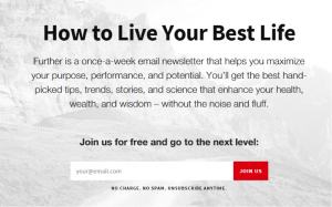
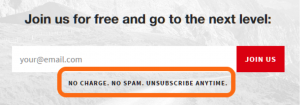
The Further.net website has a simple landing page designed for capturing emails.
There are no unnecessary links or content cluttering the page. Nearly all the content is above the fold. The menu itself has just four links.
The landing page also reassures visitors that the newsletter is free and will never send out spam.
Little things like this can convince visitors to sign-up for your list.
- Focus on the content and use a consistent design
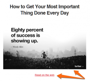
All emails from Further have a simple header image, followed by an article:
The design is minimalist, keeping in mind the purpose of the newsletter itself. There are no strong colors or bright design cues to distract from the content. The header image itself is usually black and white and has a relevant quote on it.
There is also a link right below the header to drive traffic back to the website.
Keep this in mind when you design your email marketing campaign. Use a design that matches your target audience and your email’s purpose.
- Curate the best, most relevant content
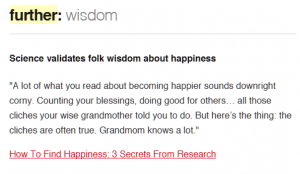
The Further email follows a simple format: there is a full article from the author, Brian Clark on a topic. This is followed by a handful of curated stories from other sources.
Brian introduces each story, usually using a quote from the story itself, then includes a link to read more. Each story is carefully selected to echo the theme of the Further newsletter – mindfulness, productivity, health and happiness.
Further’s example shows that you don’t have to publish all content yourself to create a stellar email marketing campaign. By curating the best content from across the web, you can give tremendous value to readers.
CONCLUSION
Getting email right is crucial for your content marketing efforts. Using the right design, focusing on the content, and content curation are some strategies you can use in your email marketing campaigns to get better results.
Which of these tactics have you used in your own email marketing efforts? Let us know in the comments below!


