The LinkedIn Redesign: 3 Things You Need To Know
Believe it or not, job searching and recruiting platform LinkedIn is one of the internet’s oldest forms of social media. Since it launched back on May 5, 2003, it’s grown to over 467 million users around the world. However, only about 106 million users are active on LinkedIn.
The LinkedIn Redesign: Redesigning for Reengagement
The reasons for this discrepancy vary; many users stop using the service once they’ve landed a job, or they stop using it for the opposite reason—the inability to find their next opportunity. But 2017 is looking up for the social media platforms of “professionals.” After being acquired by tech giant Microsoft on January 19th, LinkedIn announced a huge update to its desktop version the following day. The release is aimed at modernizing the platform in order to keep pace with social media competitors like Facebook. This will hopefully increase the site’s engagement, while improving the user experience and making connections easier for employers and employees.
1. The LinkedIn Look (AKA Aesthetics)
The most noticeable change in the January update is visual.
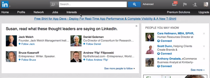
Here’s a look at the old LinkedIn interface:
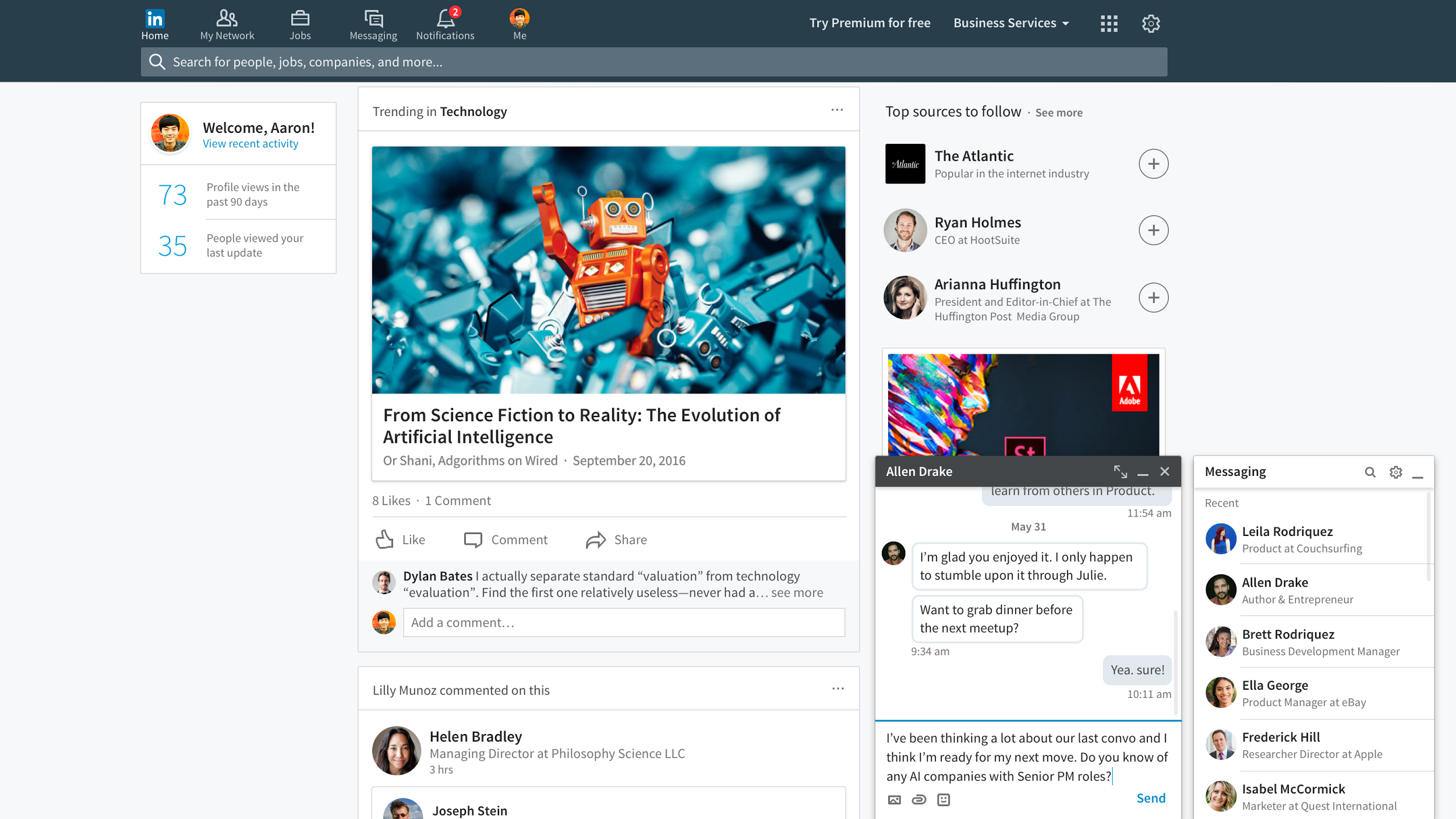
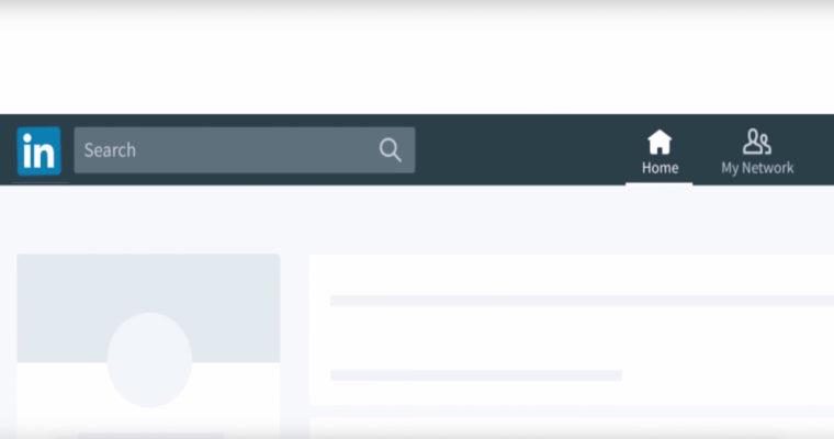
And here is the new one:
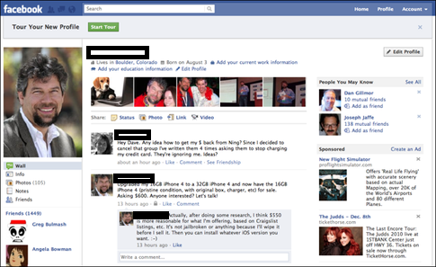
Does this look familiar to you at all? If so, it’s probably because it reminds you of this:
Indeed. It would appear LinkedIn is emulating the proven winning formula of Facebook, at least as far as aesthetics are concerned. And why not? Facebook is still the most utilized social media platform by a mile! Last year, it’s daily active users numbers increased by 18% to eclipse over 1.2 billion people.
We’ve seen this trend in web design quite a bit lately. Sites are gravitating towards a more simplistic aesthetic to make pages easier to navigate and viewable on mobile devices.
LinkedIn has always been a fantastic tool for building connections and finding jobs in any industry, but its site layout had failed to WOW users. In this new, more social media friendly update, LinkedIn is hoping its users will better realize the great features available on its platform, helping LinkedIn enter the realm of a Facebook or Twitter.
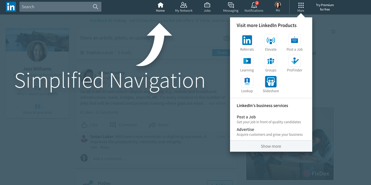
When logging onto LinkedIn these days, immediately you’ll notice a cleaner homepage. This is one of the site’s biggest improvements. It begins with the navigation bar on top.
The selections within the Apps section of the primary navigation bar used to include “Profile,” “Network,” “Jobs,” and everyone’s least favorite, “Interests.” Now, there’s just a single blue bar running across the page with more specific wording. Yes, “Interests” has been scrubbed from the navigation options. Instead, you have a simpler “My Network,” “Jobs,” “Messaging,” and “Notifications.” The latter two options signify LinkedIn’s attempt at a more ‘social’ social media branding. They want their users frequently messaging their connections as well as reaching out to clients, colleagues potential job seekers.
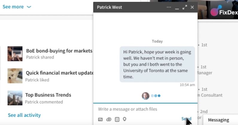
According to a LinkedIn press release, the connections you build on LinkedIn are important to growing your professional network, so they’ve made it easier to manage by streamlining the My Network tab. You can now see your connection invites, discover other professionals you may know, and manage all invitations in one place. You can also manage ongoing conversations. The chat window is also meant to encourage live interactions among LinkedIn connections, or would-be connections.
As you can see, the chat window is very Facebook-like. But as we’ll discuss later, this should help spur conversations and lead to greater engagement.
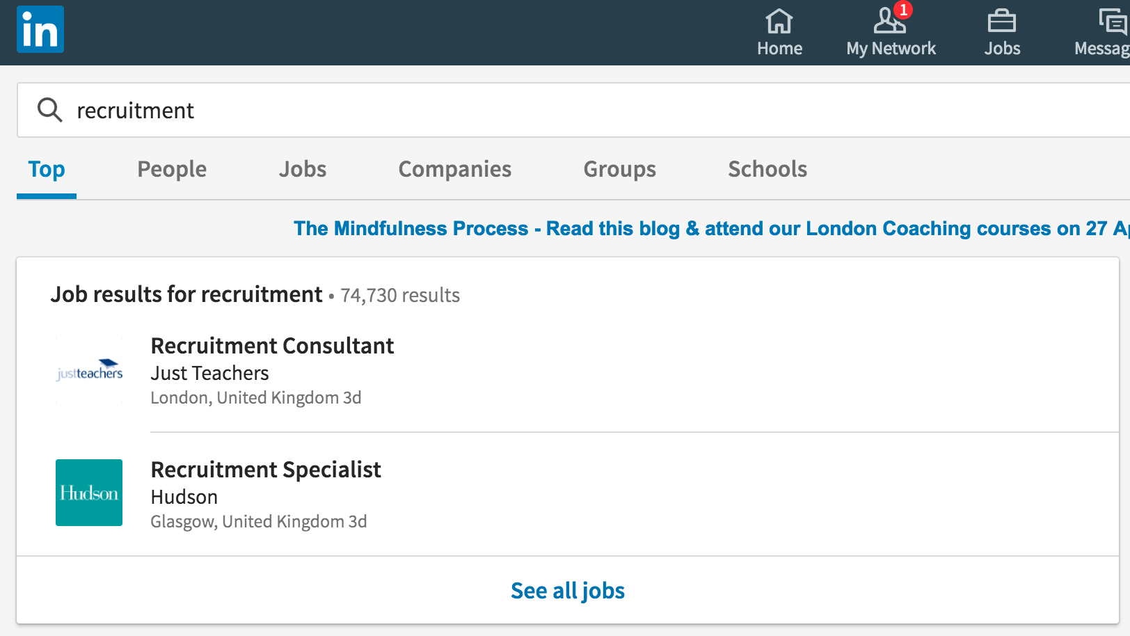
The search bar has become universal now, applying to all areas of the site and making everything searchable under one big umbrella. Previously the search bar was categorized by subjects, i.e. “people” or “jobs.” You’d have to select which area you were looking within before proceeding. Kind of a drag, or an unnecessary hurdle to say the least.
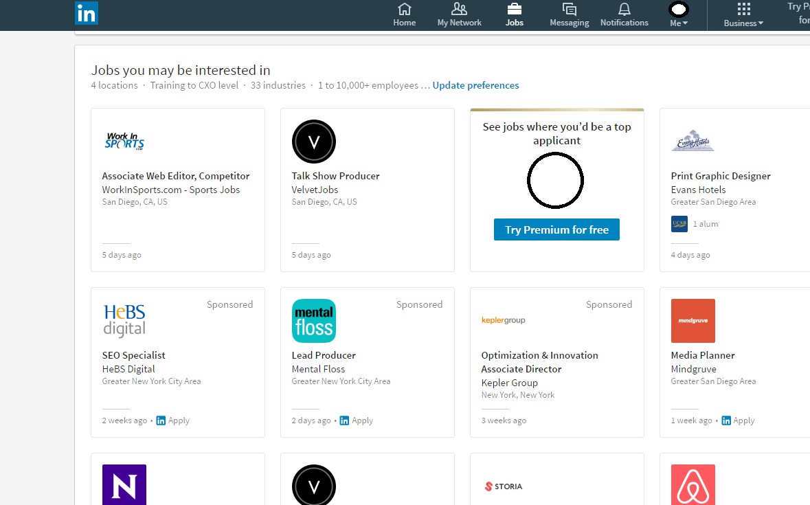
Despite the many overhauls, LinkedIn has retained the form of its most popular features. Its “jobs you may be interested in” page still makes pretty helpful recommendations and lists the positions in a comprehensive grid form that I’ve always appreciated. Now it also lists your connections who work at a given company.
So the update appears to be an overall improvement in the aesthetics of the site. How does this fare in the UX department? As we’ll discuss, the update appeals to both novice and long-time LinkedIn members.
2. Improved Usability
The new setup might be easy on the eyes, but is it easy on usability? By all accounts, yes. The squeaky cleanness of the look should lend itself to a better user experience.
LinkedIn promises its news feed will become better tailored to each user. Thanks to a combination of improved algorithms and human editors, only the stories and publishers you care about will be listed in your feed. This is also supposed to help you follow and track trending stories in reference to topics you care about. We don’t yet understand the specifics of these algorithmic changes, because similarly to Google’s updates, LinkedIn is being tight-lipped about them. But it would appear that LinkedIn is going to improve the substance of its content to keep users logged in for longer periods.
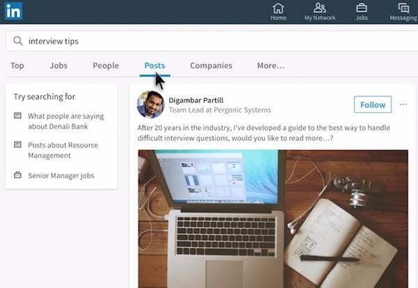
The search function as mentioned before will also help immensely in the usability department. Users can now type in any term or phrase and be shown the pertinent content of any number of different categories.
Notice above, if someone types in a phrase like “interview tips” they will be shown not only the top related articles but also the top experts in the area. LinkedIn also provides suggestions underneath “Try searching for” to make for a more precise search if the user didn’t find what they needed.
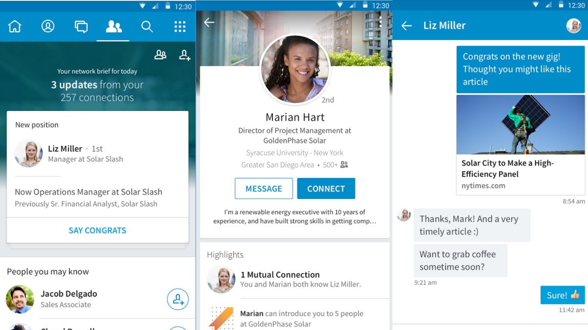
LinkedIn’s intended goal was to make the transition from desktop to mobile a seamless one for all its users.
The 2015 mobile update debuted many of the layout changes reflected in the 2017 update, including the new profile picture placement, the top navigation bar on the homepage, and LinkedIn’s messager. Since over 50% of internet activity now occurs on a mobile device, sites are updating their UI to appear consistent on both mediums. LinkedIn might be a little late to the party, but at least it’s happening now. Although interestingly enough, despite the surge in mobile usage time on site and pageviews remain higher among desktop users. This explains why LinkedIn is placing emphasis on the user’s on-site interactions, i.e. messaging and an improved news feed. More time chatting with coworkers or scrolling through relevant news stories means better engagement totals for LinkedIn.
But LinkedIn isn’t the only beneficiary from the new layout. Ultimately, this should serve to benefit YOU—the user.
3. Advancements for Employers and Employees
Aesthetics and usability only count for so much. At the end of the day, we want a service that delivers tangible results. So far, it would appear that the new and improved desktop site fits the bill in this regard. With better options and a more improved algorithm designed to assist both employers and job seekers, we are excited to see how the service continues to evolve.
- Greater Insights
To help users understand how to maximize the quality and content of their profiles, LinkedIn offers up data like “who’s viewing our profiles?” Or, “profile suggestions” that we should implement in order to attract more connections in our industry. All of these features were available before the January update, but now LinkedIn alleges they have been improved upon. It’s a hard facet to quantify since we’re only a month into the update—at the time of this writing—but we might as well take LinkedIn at their word. Given the myriad of other changes they’ve made there’s no reason not to believe the algorithm is another improvement. To this point, LinkedIn claims that job searches will use a more advanced formula to produce more precise results. Better filters also add specificity to the user’s search.
By specifying the job seeking experience, LinkedIn could be making the recruiting process much easier on employers. More specific algorithms and filters could result in more qualified applicants.
Are You Taking Full Advantage of LinkedIn?
With or without the update, there are still many users who will let their accounts sit there to rot away. Don’t let this be you. LinkedIn is a fantastic tool for building your network and establishing yourself in an industry. Are you perfectly happy in your current job? Great! You can still use LinkedIn to your advantage.
My best advice to those who currently have a job is to never get complacent. You just don’t know who can provide you that next stepping stone or opportunity to advance in your field. LinkedIn does beautiful work by placing these influencers in front you. Now it’s your job to reach out and connect! Tell them what you admire about their work and share how your job relates to theirs. For a fee of $30/mo you can directly message just about anyone on the entire platform. But even if you choose not to upgrade to LinkedIn Premium, you can still connect with relative strangers especially if you share 2nd or 3rd degree connections.
For those who don’t have a job, or don’t have one they like, LinkedIn is a fantastic networking resource that you should be monitoring regularly. I’d also recommend joining one of the site’s in-person networking groups, many of which meet once or twice a month to help you connect with industry professionals.
The look may have changed but the core of LinkedIn’s greatness hasn’t. Take advantage of this invaluable resource today.
